Hello!
After yesterday’s post about how to add Bootstrap to a web project in Visual Studio 2012 or 2013, today I will explain a little more about the way that Bootstrap allows to work with with elements in a grid.
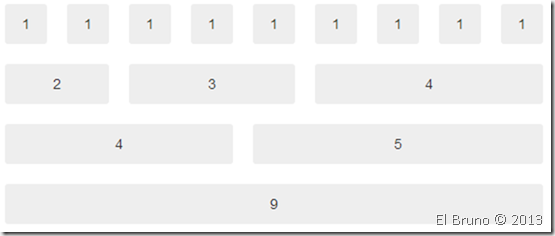
The simplest model that proposes Bootstrap is based on a grid with 12 columns. Basically is possible to assemble groups of columns that always add 12, in example
- 4, 4, 4
- 2, 4, 6
- 1, 3, 4, 1, 3
- etc
The following image, extracted from the official doc explains it so that everybody can understand this, even dumb people like me.
When you have to to create this type of tables , you must start with a DIV element with the class row and then the interior components with a fixed scheme that works “in all resolutions”, with classes
- .col-xs –; for extra small devices < 768px
- .col-sm –; for small devices > = 768px
- .col-md –; to medium devices > = 992px
- .col-lg –; for large devices = > 1200px
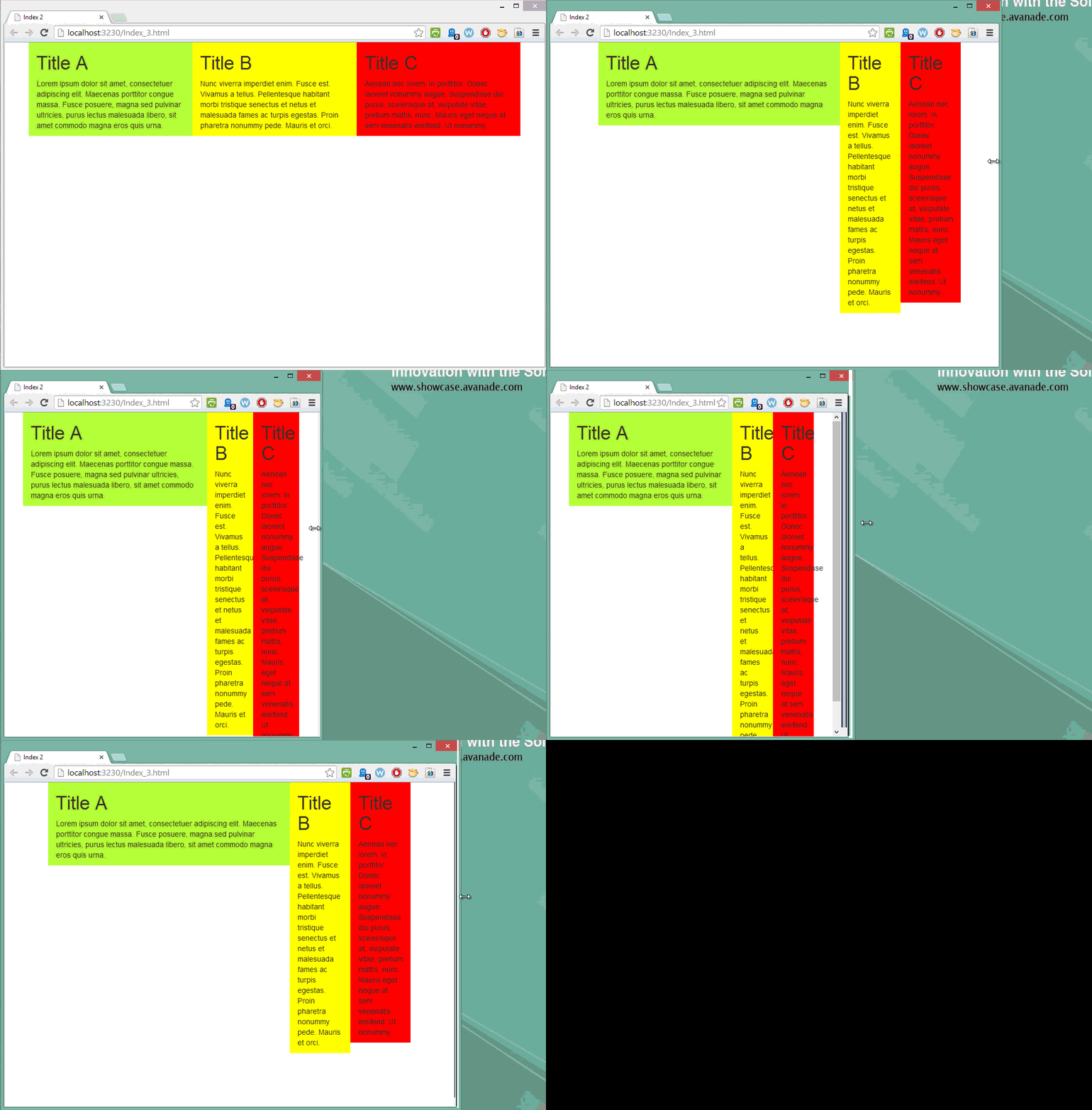
The following example defines a 4,4,4 to medium devices size and size 8,2,2 for small devices
1: <div class="container">
2: <div class="row-fluid">
3: <div class="col-md-4 col-xs-8" style="background: greenyellow">
4: <h1>Title A</h1>
5: <p>
6: Lorem ipsum dolor sit amet, consectetuer adipiscing elit. Maecenas porttitor congue massa. Fusce posuere, magna sed pulvinar ultricies, purus lectus malesuada libero, sit amet commodo magna eros quis urna.
7: </p>
8: </div>
9: <div class="col-md-4 col-xs-2" style="background: yellow">
10: <h1>Title B</h1>
11: <p>
12: Nunc viverra imperdiet enim. Fusce est. Vivamus a tellus.
13: Pellentesque habitant morbi tristique senectus et netus et malesuada fames ac turpis egestas. Proin pharetra nonummy pede. Mauris et orci.
14: </p>
15: </div>
16: <div class="col-md-4 col-xs-2" style="background: red">
17: <h1>Title C</h1>
18: <p>
19: Aenean nec lorem. In porttitor. Donec laoreet nonummy augue.
20: Suspendisse dui purus, scelerisque at, vulputate vitae, pretium mattis, nunc. Mauris eget neque at sem venenatis eleifend. Ut nonummy.
21: </p>
22: </div>
23: </div>
In implementation looks something like this
By the way, many thanks to Gorka (@Gk_8) for making me remember explain col-xs -… ![]() and thanks to Sergio León (@panicoenlaxbox) by explain version 3 bootstrap!
and thanks to Sergio León (@panicoenlaxbox) by explain version 3 bootstrap!
References:
- http://getbootstrap.com/2.3.2/scaffolding.html#gridSystem
- http://getbootstrap.com/css/
- http://getbootstrap.com/examples/grid/
- http://getbootstrap.com/getting-started/#examples
Greetings @ La Finca
El Bruno


Leave a comment